It took me and my group 9 long weeks but we finally finished our project Smart Tech. Some challenges were team collaboration but other wise we were fine. We struggled to finish up stuff at the end but we got it done on time if but barely. I learned teamwork skills, to come out of my shell even more, to work efficiently, and meet deadlines on time. I was given good feedback to what I could use and change later in the future. We changed our whole logo because we decided to go for more of a company approach than just a product approach. Overall I had fun with this and it was my favorite part of E-comm this year and my favorite thing at school this year.
I used my class time well and worked on what my group needed me to get done like the animations, the logo, and the ads. I went back and checked everything multiple times correct it and tweaking it to make it the best possible. Outside of class I play video games and watch movies to see different animation styles and see how things move and act and compare them to their living counterparts. I also look up how movies and video games were made to get a better feeling on how it works because that is what I want to do when I'm older which is to make Video Games and Movies.
My strengths that have grown this year are in Animation and Videography/Filming. I've learned the basics to prepare me for next year and get me started on the journey that will be my life later down the road. I know I've only broke the surface of E-comm this year but I can't wait for next year when I'll learn more and more and more.
Areas I need improvement in are probably Web Design. I get it but it's still confusing so I have to try to understand it better and work on it more to do better.
I loved the whole create you own product idea from the very beginning. I would maybe make the presentations in the Auditorium other wise I leave everything the same. I learned to put everything that I learned in Quarters 1-3 into one project. I would like to make something amazing in animation next year.
Wednesday, May 23, 2018
Sunday, February 25, 2018
SketchUp House


Description: This is my house that I created and here are 2 of the textures I took from the internet. I choose this house to do because I thought it looked cool and would be fun to create. I took the trees from the tutorial but made the rocks and the pond myself.
What I learned: I learned the basics of SketchUp and how to make something from scratch. I also learned how to put in how long or wide something has to be and I also learned hoe to make a slanted roof and windows.
How it went: It did take me awhile to find a house but I eventually did. I did learn how to create windows I just forgot how too but if I had remembered then my house would of looked ten time better. Overall it went smoothly and the only thing I had trouble with was the fence on the deck.
Monday, February 5, 2018
My Personality Type


Intuitive: I have always that of the bigger picture than the smaller details because it gives me something to work toward and I like the feeling of earning something after I've put a lot of time and effort into it.
Feeling: I've always been an emotional person and have always had a big heart and let my decisions be decided on feeling rather than logic so I basically follow my gut a lot of the time.
Judging: I have always liked to plan ahead and observe my enemy in video games to predict when, where, and how they might attack and what they might attack with. I always like having a plan before I fight or work or play so I don't go into something blind.
On the Lion, Otter, Beaver, and Golden Retriever I was 34 lion and 34 otter, 26 golden retriever and 16 beaver.
Ball Bounce


What I learned: I learned the basics of Adobe Photoshop and how to actually make an animation from something simple like a ball bouncing up and down to the Tardis coming into frame and The Doctor coming out of the Tardis in the form of a ball.
How it went: It went really well for me and I probably spent two or three days on the Tardis (Time And Dimension In Space) alone. It was a last minute decision but I decided to make the ball like The Doctor. Overall the first two animations were fairly easy in my opinion.
Monday, December 18, 2017
WEB project final
I used Adobe Dreamweaver for my project and I instantly understood it without having any trouble. I used two of my project that I think I did really well on from quarter 1 and quarter 2 and the colors I chose I think go really well together.
I learned about the software and how to use it with adding pictures, videos, links, and the date modified. I also learned how to work Adobe Dreamweaver for the future because I know I will use it again in the future.
I think that I actually did a great job because I knew how to use the software and figured things out pretty quickly. I will be able to know how to create a web page in the future and how to add links to things as well as how to use Adobe Dreamweaver.


Tuesday, December 12, 2017
Elevator Pitch
Hello my name is Alex Tolman
and I’m currently a 21st century student at Olathe Northwest in the
E-communication program. I am looking
for a job that needs an animator either computer or hand-drawn. I’m very talented when it comes to drawing
and I work very well with technology so I could work for both or either one. I’m am very resourceful because I am book
smart and very good at coming up with ideas and I’m very adaptable. I can get very competitive but I’m very
strategic. I also have a big imagination
allowing me to create new ideas and my passion for my work allows me to succeed.
Monday, December 11, 2017
My Logo

Logo design: I knew that I would want the dragon head in a circle so that part was easy. The head is comprised of two ovals a bigger one on top of the smaller one. The ears are made of three triangles with arches in between. The horns are 4 triangles and the nostrils are two ovals as are the eyes. The arches in the middle are to make it realistic and the lines above the eyes are supposed to be like eyebrows. I knew that the colors that I would use would be Gold(representing Life and the force of good) and Green(representing Nature and the force of good). The horns I tried a bunch of colors and this is the one that seemed right to me
Friday, November 17, 2017
OZ poster

I used contrast on the characters because it's in the middle of the page and it would also make the title catch their eyes. I put the characters opacity at 100% and made a outline around it to make it stand out and the title is just above it so when people look at the image they'll see the title and know what the play is about. I also used contrast on the time, date, and the price of the tickets. I made the color of the font white so it will stand out and after you see the title the white draws your eyes to it and you get the info you need.
Alignment:
I used alignment on the text and made it left aligned. The text on the bottom are all aligned with each other. The title and who is running the show aligns with each other. And the text at the top aligns with the left side of the poster. The image I put in the middle so it will catch people's attention.
Repetition:
I used the same font for the text on the top and bottom of the poster to make it unique but used a different font for the text in the middle like how Oz is in between worlds. I tried to use the same color of gold for the ONW presents and the characters so it would match each other.
Proximity:
I used the middle of the page for the characters and the title so it would fill the space and aligned the text on the left side to fill all the green space. I also tried to center the characters in the middle where they wouldn't overlap into the yellow brick road.
Friday, November 10, 2017
Typography Project

What I learned: I learned to not spend so much time looking for something next time. I also learned to take my time and try not to rush.
How it went: It wasn't that bad and I think that I did pretty good in the limited time I had. I also think that I'll get a good grade on this.
Color Wheel

Description:
My project was the color wheel as seen above. It didn't really take me that long to make it because I already knew had to use adobe illustrator. This wasn't that hard and even if I didn't know how to use illustrator I would've figured out how to use it.
What I learned: I learned the different types of color choices and the exact locations on the color wheel.
How it went: It went really good because I already knew how to use the software.
Friday, November 3, 2017
Color scheme logos
Alex Tolman


This logo uses the Monochromatic colors of Black and White. I think the reason behind using Black and White was to make intimidating and kinda of protecting at the same time.

This logo uses the Monochromatic colors of Black and White. I think the company used these colors to catch people's eyes and make it bold and rememberable.

This logo uses the warm colors of Red, Yellow, and Black. I think the reason behind using these colors was to make it look prehistoric and ancient.

This logo uses the warm color of orange. I think the company chose this color because everyone like orange drinks and it would catch peoples eyes.
This logo uses the cool color of blue. I think the reason for choosing this color was to make it kinda of rememberable and a sign of good.
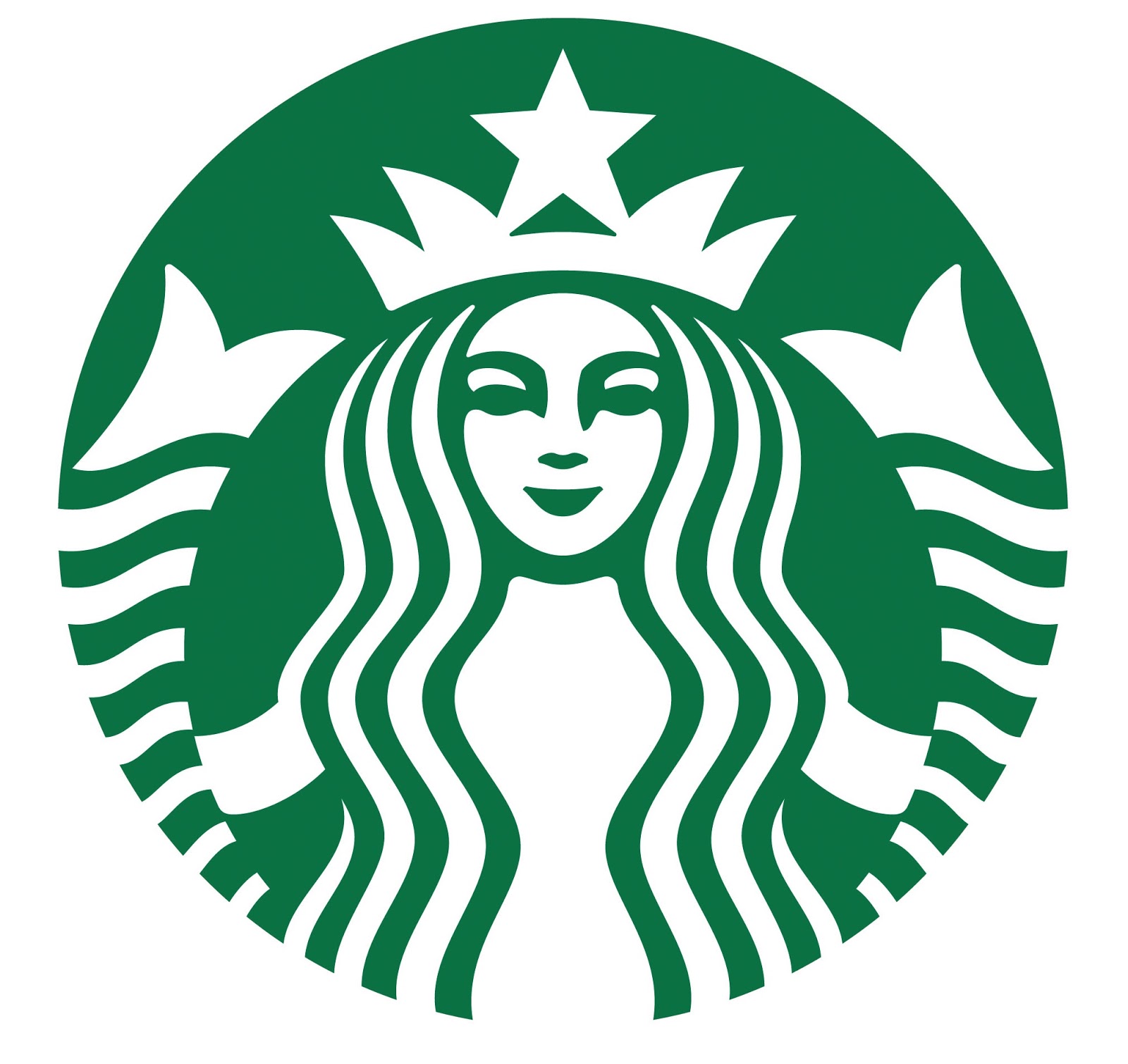
This logo uses the cool color of green. I think the reason the company used this color was to make it environmental and peaceful.

This logo uses the analogous colors of Green. I think the company used these colors to make it seem environmental and nature like.

This logo uses the analogous colors of Green and Yellow. I think the company chose these colors to make it unique and eye-catching.
This logo uses the complementary colors of Red, Orange and Green. I think the company used these colors to make it different and unique in its own way.

This logo uses the complementary colors of Red, Orange and Green. I think the company used these colors to match what colors there original drinks were.
Subscribe to:
Posts (Atom)